National Gallery Singapore
My Role
UI/UX Design
User Research
Timeline
2 Months
National Gallery Singapore is is a public institution and national museum dedicated to art and culture. They have a wide range of target customers, ranging from local families, kids to tourists. The new app aims to streamline the guided tours booking and check-in process.
This is a case study for Google UX Course.

The Problems
-
Visitors are finding it difficult to book the tours on the website
-
Visitors need to wait for a long time to check-in their guided tours during peak season

User Pain Points
01
No clear navigation to book a tour on the website.
02
The booking process is not user friendly. Users have to go through unnecessary steps before booking a tour.
03
Booking confirmation is sent to users email and there’s no reminder before the tour. More often than not, users are not able to find their ticket.
04
Long queue at the gallery to check in guided tours during peak seasons or when there’s a large group visiting.
User Persona

Problem Statement
Zareen is a busy creatives who needs a faster way to book art tours and check-in the tour quickly so she doesn’t waste her precious weekends time standing in line.
Paper Wireframes
I took some time to sketch and ideate the homepage to display the available tours in a clear layout.
I also came out with a few ideas to provide a hassle free check-in process for the users.

Digital Wireframes
As the initial design phase continued, I made sure the base screen designs reflect the feedback and findings from the user research.


Low-fi Prototypes

Usability Tests
I conducted two rounds of usability studies. Findings from the first study helped guide the designs from wireframes to mockups. The second study used a high-fidelity prototype and revealed what aspects of the mockups needed refining.
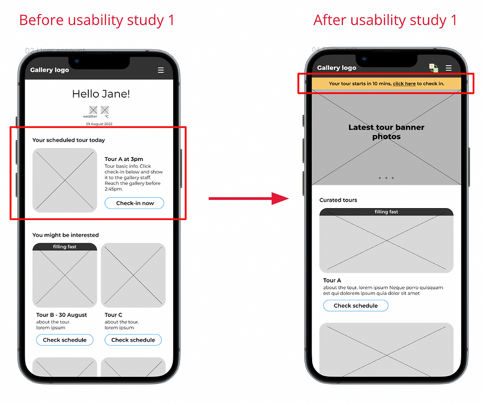
Round 1
I created a notification bar on the home page (10mins before the tour) so users can access the check-in page easily.
.png)
Round 1
Added in-app translation function for international travellers/users.
.png)
Round 2
Increase legibility of tour info.
Added bottom navigation bar so it’s easier for users to find their booked tours.

High-fi Prototypes
The final high-fidelity prototype presented a clearer user flows of booking and checking in an art tour. It is visually appealing while maintaining the brand image of National Gallery Singapore.

See high-fi prototypes here.
Impact
“This is great! I will keep using the app whenever I go to National Gallery of Singapore. I love that I don’t have to dig into my email inbox again to find my check-in ticket!”
Takeaways and Next Steps
I have learned that the design process never stops. While getting the users’ feedback, I actually get more ideas in improving the functionality of the app and how to make the whole experience better for the users.
Moving forward, I'll be conducting more research to find out the adoption rate of this new app and areas for improvement.

Next Project
A platform designed to provide support and reliable information to those whose lives are impacted by cancer.