Our Cancer Stories
My Role
Responsive Web Design
UI/UX Design
User Research
Brand Building
Team
Full Stack Engineer
Data Analyst
Copywriters
Timeline
10 Months
(from concept to launch)
2 Months
(homepage design revision)
Our Cancer Stories is a platform designed to provide support and reliable information to those whose lives are impacted by cancer. Featuring 6 most diagnosed cancer types, the website has over 400 real-life stories and 400 research-based articles. I led the website and UI/UX design from concept to launch.
The goal of this presentation is focusing on the homepage design changes after launch.

Why Do We Need to Change?
After launching the website in September 2024, we've been monitoring the traffic quality and conduct user research to identify the area for improvement. After doing the user surveys and analysing the traffic, we identified the areas we need to work on to improve the overall user experience and traffic quality.

User Feedback
The look and feel is calming but I’m overwhelmed by the information, I’m not sure where to click.
There is a lot of information on the website, but the key purpose is not clear.
Looks professional but a little cluttered in terms of number of words and graphics.
I like the visuals of the cancer categories, but for me the number of stories are not that critical.


Problem Statement
From the user feedback, we landed on 2 key areas to improve on the homepage design:
1. User Engagement & Navigation from Homepage
The current segregation of stories and articles on homepage doesn’t encourage user to explore further, resulting in limited exploration and fewer clicks to explore the content.
2. Information Overload
There’s a lot of content going on at the first glance and most users are not sure where to click.
Business Goals
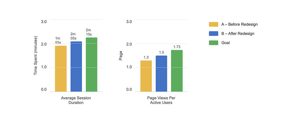
I work with data analyst in the team and stakeholders to quantify our goals for the next 3 months. We decided on Average Session Duration and Page Views per Active User as our key metrics: the longer they stay and the more pages they view indicating their interest in the website and overall their satisfaction of the user experience.

Understanding The Current Traffic Quality
As Our Cancer Stories is a new website, the majority of traffic relied on paid traffic from google ads.
A very interesting finding was that around 70% of the traffic came from symptom pages as the related keywords are the most in demand. However, users who visited the symptom pages do not spend much time on it.
This finding also leads to a potential A/B testing of the key symptoms pages.

New Design Ideations
To create a layout where stories and articles receive equal emphasis in the user interface.
To improve visual hierarchy where cancer type buttons could stand out as users are only interested in a specific cancer.
White space, white space, white space!
Body text space for SEO keywords.
Focus on topics users are interested in, symptoms?
Solution Analysis
Desktop

Clearer Navigation
Buttons to navigate to each cancer type landing page, with white space to breath.
SEO Optimisation
Text space for each section SEO optimisation.
About the Website
A short intro and link to About Us page for users to familiarise with the website.
Thematic Organisation
Displaying the content according to the cancer journey, from symptoms, detection to treatments.


Solution Analysis
Mobile
Mobile-first Approach
Jump right into navigation buttons after header for mobile users, who have a more targeted goals when exploring the website.
Thematic Organisation
Displaying the content according to the cancer journey, from symptoms, detection to treatments.
SEO Optimisation
Text space for each section SEO optimisation.
User Feedback After Design Revision
“I like that it's very clear for patients who are on different phases of their cancer journey.”
— Breast Cancer Patient, 53
“Overall, I appreciate that the homepage is not too long. Colour palette is mute, which I feel that it fits perfectly for the ‘cancer’ theme.”
— General Viewer, 38
“The website is bright and inviting with a good layout. It is easy to navigate and find the various subsections.”
— Caregiver, 44
Impact
Result from A/B Testing after 7 days (ongoing A/B testing)
Moving Forward
The design process doesn't stop here. We continue to run A/B testings on the key symptom pages to further improve traffic quality and increase users engagement.
The ongoing effort includes,
-
A/B testing on key pages to improve views per session and users engagement.
-
A brand new section to focus on Cancer Prevention and Wellness.
-
A dedicated Partnerships page to prepare for monetisation.


Reflections
This is the first product I officially shipped. Throughout the design process, I was constantly reminded how important it is to empathise with users and understand their needs rather than focusing solely on visual appeal.
I also learned how to thoughtfully integrate feedback and requirements from stakeholders and team members, while ensuring that the users’ needs remained at the core of every design decision.

Next Project
A case study of National Gallery Singapore. I designed a new app to streamline the guided tours booking and check-in process.